Friday 16 December 2011

Silkscreening a Pattern in Weaving


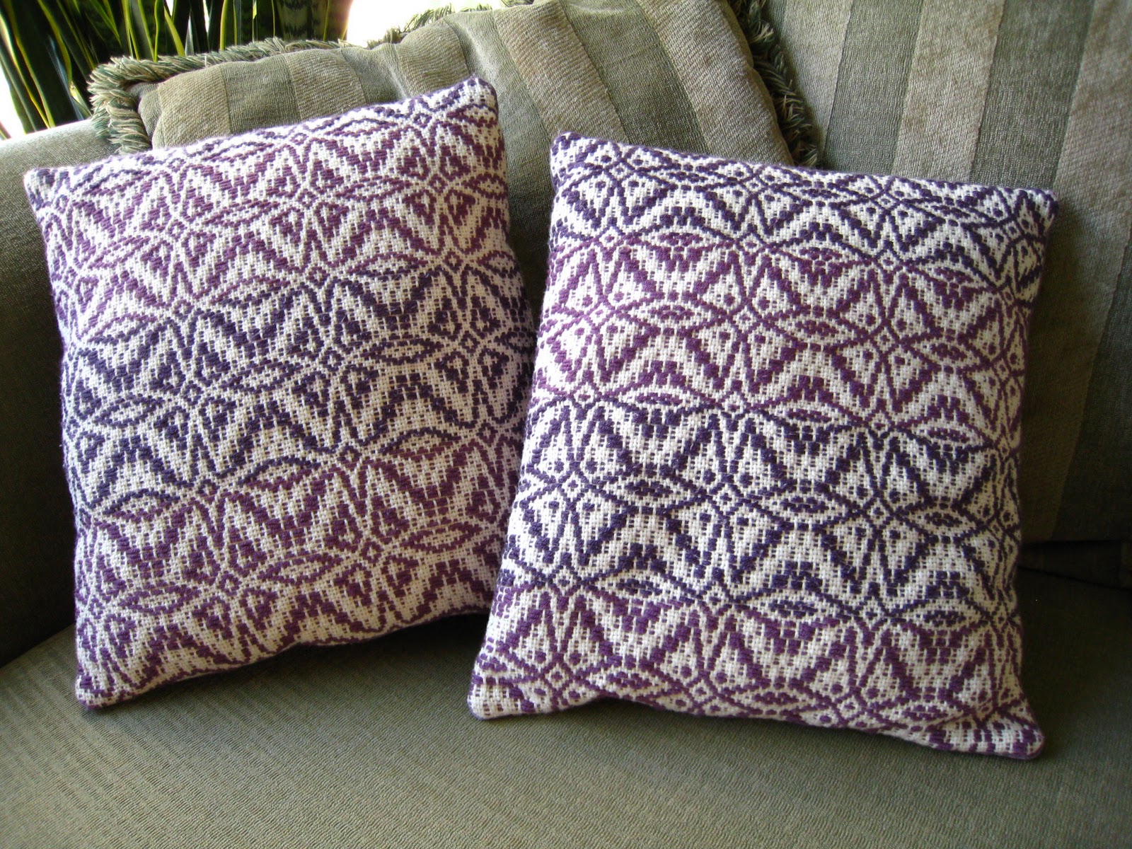
This past summer I was absolutely enchanted by a weaving pattern that resulted from using the cornucopia tool in Weavemaker, a program used to design weaving patterns. Cornucopia can be used anywhere within the pattern: on the treadling, the threading, the colours or the tie-up and the results can range from awful to fabulous! I warped up with the Perwinkle pattern from A Handweaver's Pattern Book and used the cornucopia tool in the treadling section until I got the awesome pattern shown below.

For my final project in Surface Design I used the print out of the pattern, which appears as a  geometric rendering of the weaving structure, and transferred the three resulting images to silkscreens using Photoshop and a scanner.


I screenprinted the yardage in an ombré colour palette that began with burnt umber and transitions through burnt sienna, raw sienna and ended with yellow ochre.

The reason that I love this pattern so much is that the repeat structure is deceptive. At first glance it appears to be a simple, diamond-shaped repeat structure of two motifs, but there are actually eight unique diamond repeats within this structure that are randomized within the pattern to create sixteen different repeats.


The image above was taken after heatsetting the yardage first in the dryer for 2 hours and then with a heat press.

Unfortunately, I was inconsistent with the heat pressing, despite my thinking that I was being so methodical, and after I washed the fabric there are some pretty obvious areas of wash out. Luckily, part of the criteria of this project was to layer silkscreening and embellisment techniques, so I have begun to cover the washed out areas with a four-sided embroidery stitch that makes the mistakes look like intentional design components....sort of.


Friday 25 November 2011

Tablecloth - Fall Leaves Kaleidoscope

The inspiration for this surface design project was the gorgeous leaves of fall in their brilliant hues of red, maroon, orange and yellow. I took dozens of photographs of assorted maple trees...


...and finally created a kaleidoscopic image in Photoshop of a worm's eye view of the maple in front of my brother's house.
The image was then burned onto photo emulsion screens in two separate layers and screen printed on Sante Fe cotton/linen fabric that I dyed with Procion MX in a very pale shade of golden yellow.

Here's the final product...its not intended for a table of this size. The measurements are 54" x 54" which is suited for a small 30" square table.

Wednesday 16 November 2011

Weaving Project - 'Colour & Weave' pillows


Here are some pictures of my second project in weaving this semester. The colour and weave sample I did previously helped me to design the fabric for these pillows.
Sewing is not my strong suit, and I was lucky to have my classmate, Patty, help me to sew up the interior pillow casings at the last minute (the morning that they were due). 
My instructor in Surface Design, noticed me stuffing the pillows with wool the night before and suggested that it would be so easy to make casings, but did I listen? No, because I don't like that it takes me so long to sew; its painful! Instead, I just went right on stuffing them until they were good and plump...and lumpy, so after a night of contemplation I had to admit that they did indeed need casings.


Warping up...


I love how the back of the loom looks when it is all warped up!


Monday 19 September 2011

Weaving a colour gamp sample

This is my first experiment with weaving a colour gamp sample. Traditionally a gamp would serve as a reference tool for weavers to test out colour combinations for a project they are planning. (This is also my first time weaving on a floor loom!~very exciting!)
For this sample I chose four colours (turquoise, gold, brown, and rust) in 8/2 cotton with the warp sett at 20 epi and woven in a balanced plain weave.

Sunday 24 July 2011

Itajime and Indigo

I want to make some curtains, similar to traditional Japanese noren, to hang in the doorway between our kitchen and livingroom (I ended up using them for the doorway to the balcony instead).
Using a shibori technique called itajime, where the fabric is first folded and then clamped, I dipped the cloth in an indigo vat. The pattern is called kikko (tortoiseshell) and it makes a hexagon shape.

Itajime (board clamping)


After the indigo has oxidized, the clamp and boards are removed


I learned a lot from my mistakes with this project, for instance I waited a mere 24 hours before washing the fabric, so they faded a fair bit. (For optimal results, you should wait a week before washing) And I think the panels would match up better if I sewed them first and then did the clamping and dyeing. Also...and this is embarrassing...I cut the fabric the wrong way, so they don't drape properly. The bright side is that they allow lots of light to filter in while giving me optimum privacy from our neighbours!


Thursday 14 July 2011

Indigo Dyeing

Here are some images from an indigo dyeing session at home on the balcony. I opted for the synthetic indigo from Maiwa and I was really happy with the vat!
I wanted to try dyeing some natural cotton yarn and make some lace placemats (pattern by Carol Strickler from Best of Handwoven - Top Ten Placemats ) for my mom for her birthday.

 'Indigo white' vat


Couldn't resist dyeing a few shirts...
 Here are the completed placemats. I dyed the cotton in two shades of indigo blue; a lighter one for the warp and a deeper shade for the weft.

After finishing these I wanted to make another set for my mother-in-law. This time I thought I would try a natural coloured warp and a darker indigo for the weft.

 I like the appearance of these ones. I think the contrast of dark and light make them more  visually interesting; they look somewhat French Provencal to me.


Weaving

The following weavings were woven on a 4-harness table loom.

For my first weaving project using Ciba acid dyes I chose to dip-dye the warp (Cascade 220 ~ 100% Peruvian Highland wool yarn) in a bunch of vibrant colours inspired by a picture of flowers. I dyed the weft, a worsted-weight Malabrigo merino wool, a pale turquoise colour.


The pattern used is called 'Shaded Twill' from A Handweaver's Pattern Book  by Marguerite P. Davison.


This pattern is called 'Maltese Cross' from A Handweaver's Pattern Book and was woven with an 8/4 cotton warp. The weft is a combination of two Sublime dk weight yarns; the lighter purple is an extra-fine merino and the dark purple is cashmere, merino, silk blend.